
Native advertising for independent publishers
Three native ad formats for independent publishers, with practical examples, clear labels and a checklist for reviewing placements on desktop and mobile.
In this article
What native advertising is
Native advertising is paid advertising that looks like it belongs on the page. It uses the same fonts, image shapes and spacing as the content around it, instead of arriving as a banner from somewhere else. One thing does not change: the reader still has to see that it is an ad.
Two quite different things go by this name. One is native display: a small unit with an image, a headline and a link, placed in a feed or between sections of an article. The other is the sponsored article, where an advertiser pays for a whole piece of content. This guide is about the first. IAB UK makes the same split in its creative guidelines.
This is the kind of advertising Plakard is built for: an ad space the publisher designs to fit their own site, used by businesses whose customers already read it. A bike-fitting studio on a cycling blog is not a stranger to its readers.
An ad card in a cycling feed
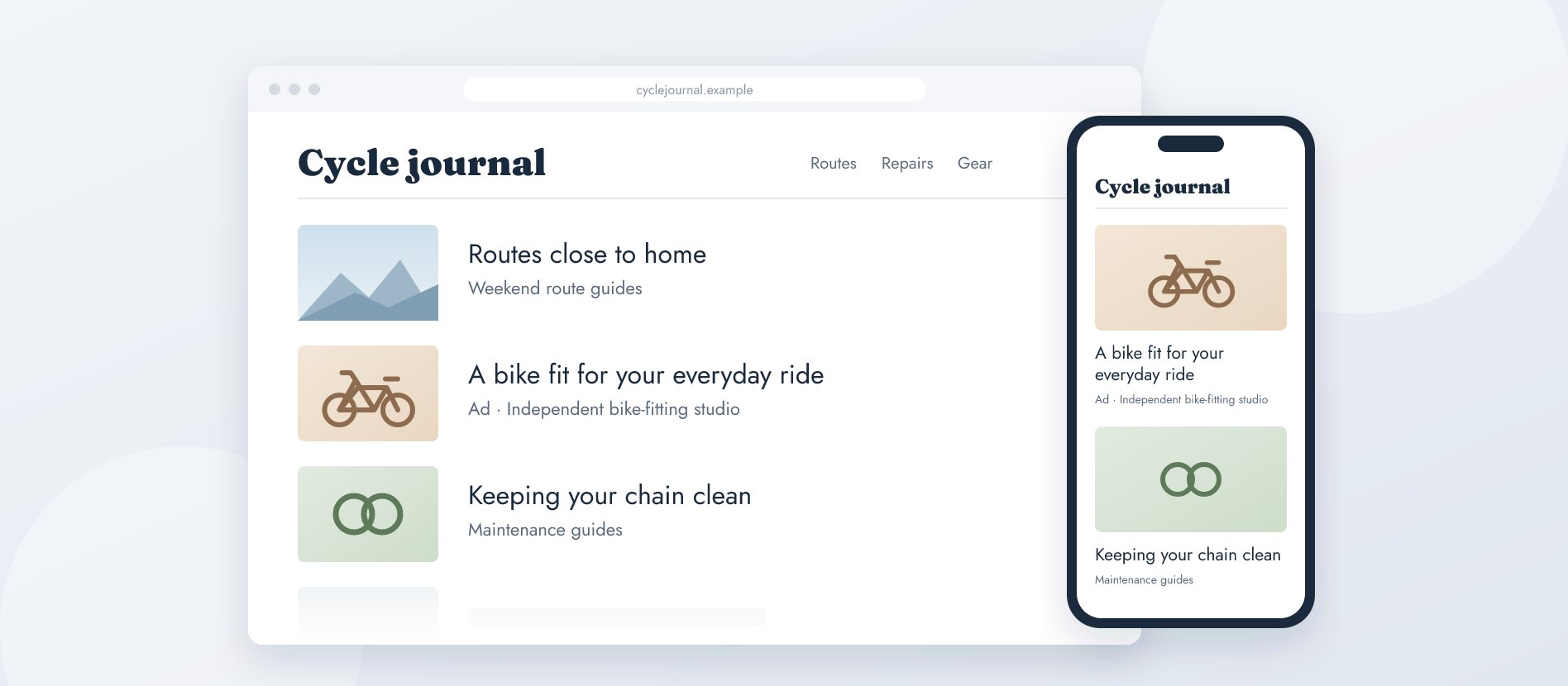
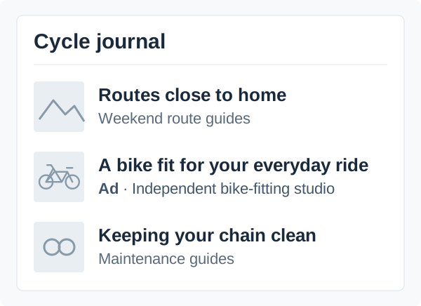
Take a cycling site whose homepage is a list of route guides and repair articles. Between two of those stories sits a card from a bike-fitting studio. At a glance it looks like the rest of the feed: same image shape, same spacing, same headline size. What sets it apart is the small grey line under the headline: “Ad”, followed by the studio’s name, in the place where the other cards name their section. The headline says “A bike fit for your everyday ride”, and the whole card links to the studio’s booking page. A reader who clicks knows where they are going and who is sending them there.
Two decisions keep this working over time. The publisher fixed one image shape and a short headline limit, so every new ad fits the feed without manual fixes. And the “Ad” line stays with the card on a phone, where the grid collapses into one column and a label is easiest to lose. What the card never gets is a byline or an “editor’s pick” badge, because those belong to the editorial content.
An ad between two sections of a guide
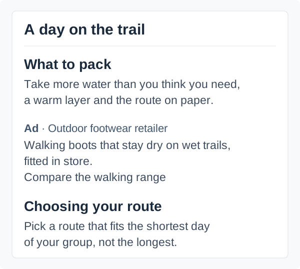
A walking site has a long guide to preparing for a day outdoors. The packing section ends with a short list of what to bring, and only then, before the next section starts, comes an ad from a footwear shop for its walking boots.
The position is the whole point. The reader has finished one thought and has not started the next, so the ad interrupts nothing. The ad itself is written like the article around it: two lines of plain text in the same type, with a small grey line above them that says “Ad” and names the shop. There is no image and no box. The only link, “Compare the walking range”, says what it does.
Placements like this are often inserted automatically, for example after every fourth paragraph. That rule works until it drops an ad into the middle of a checklist. Before you settle on a rule, open a few real articles, with their headings and lists, and see where the ad would actually land.
An ad as the next step in a guide
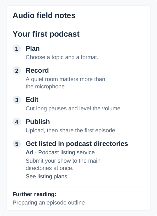
An independent audio site keeps a step-by-step guide to producing a first podcast: plan, record, edit, publish. Right after the fourth step comes a fifth item in exactly the same form: “Get listed in podcast directories”, offered by a listing service.
It reads as the natural next step, because once the first episode is out, the next question is how people will find it. The difference is in the line under the title: a small grey “Ad” with the service’s name. Below it, one sentence says what the service does, and the link, “See listing plans”, says what happens next.
This is the format closest to the guide’s own advice, so the mark matters most here. Editorial recommendations on the same page, like the “Further reading” link below the list, never carry the ad line, and the ad never appears without it. Otherwise readers cannot tell which advice was paid for, and the guide loses the trust that made the ad worth placing there.
Say clearly that it is an ad
All three examples share two things: a label that says this is advertising, in the language of the site, and the name of the advertiser. An ad that is open about itself costs the publisher very little. An ad that readers only recognise after the click costs the trust in everything around it.
The same goes for the link. The headline promises something, and the page behind it should deliver exactly that. Advertisers change their texts and images over time, so look at the card and its destination again whenever they do.
Check it on a phone
Most problems with native ads show up on a phone. The grid becomes one column, images are cropped differently, and a label that sat neatly above a headline can end up far from the ad. Open a real article on a phone and read it the way a reader would, then once more with larger text and once using only the keyboard.
Watch the page while the ad loads. If the content jumps just as the reader goes to tap something, they land on the advertiser’s page by accident, and nobody gains from that click.
Change one thing at a time
Looking like the page does not mean anyone looks at the ad. In Nielsen Norman Group’s eye-tracking studies, readers skipped ads inside content as well, on desktop and on mobile.
If you want to improve a placement, change one thing and keep the rest as it was. A more specific headline is a good first test. Write down which pages, devices and dates the test covered, so you can compare it with what came before.
Be careful with what the numbers say. An impression means the ad was shown, not that someone paid attention to it, and a click is not a sale. It helps to ask a few readers directly: can they tell who the ad is from and where the link leads? If the answer comes from a handful of people, treat it as a first impression, not a result.
A checklist for your first placement
- Pick one page type and one place on it for the ad.
- Fix the image shape and the headline length.
- Keep the ad label and the advertiser’s name visible at every screen width.
- Keep paid cards apart from your own recommendations.
- Read a real page on a phone, with larger text and with the keyboard.
- Watch the page while the ad loads.
- Test one change at a time and write down what each number counts.
- Look at the destination again whenever the advertiser changes the ad.
Start with one placement
Planning an ad space on your own site? Join the waitlist and we will let you know when Plakard opens to publishers.