
Banner blindness: why readers skip ads
Why people skip what looks like an ad, how an ad can hide the content next to it, and how publishers and advertisers can test one change at a time.
In this article
Readers skip what looks like an ad
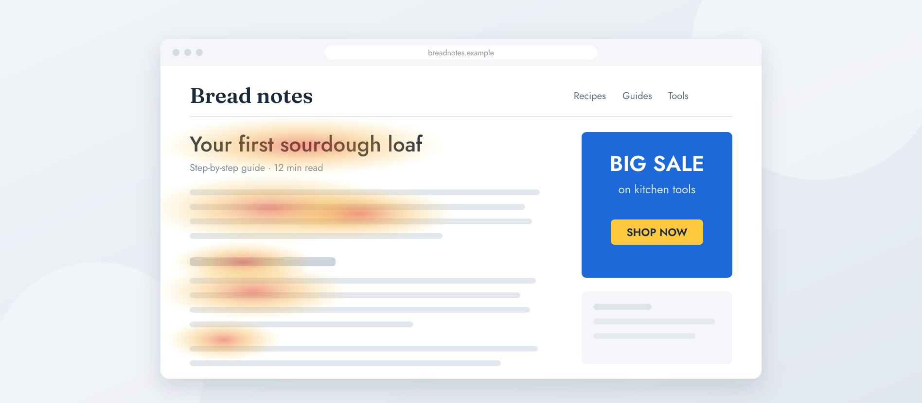
In one of the study’s tasks, people read a page about a dancer’s training. After the first block of text sat a small blue rectangle promoting something else. Most participants did not look at it at all.
The researchers list what gave it away: a small rectangle in the middle of the text, unusual formatting, a blue background on a white page, and text set inside an image. Each of these told readers that the box was not part of the article, so they could safely ignore it.
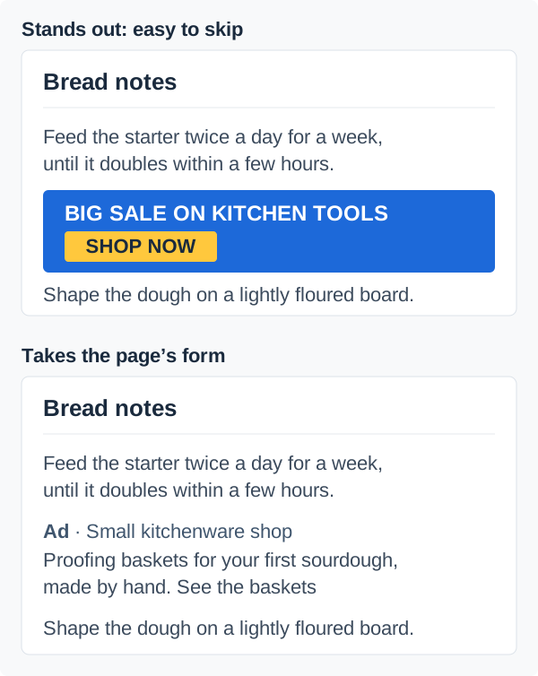
For us, this is the strongest argument for ads that take the form of the page. An ad set in the site’s own type, with the site’s spacing and image shapes, does not announce itself through its design. It still has to say clearly that it is an ad, but readers learn that from the label, not from a box that looks out of place.
An ad can hide what sits next to it
The third signal is the one publishers notice least. When an ad shares an area of the page with other content, readers tend to treat the whole area as advertising. In the study, a reader glanced once at a side column, saw sponsored stories, and never looked back, although the same column also held useful how-to videos.
The researchers call this the hot-potato pattern: after one look at something irrelevant, people avoid that part of the page, sometimes on later pages and other sites too. In another example, a side column that took up a quarter of the content area received less than one percent of a reader’s attention.
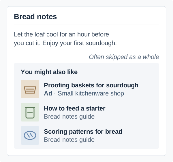
For a publisher, the lesson is that your own recommendations, related articles and useful links need a part of the page that is clearly yours, away from the ad. Otherwise the ad costs attention for your own content as well.
On a phone, an ad is hard to miss and easy to ignore
Phones change the picture in two ways. An ad between paragraphs fills a large part of a small screen, so the reader’s eyes pass over it while scrolling. In the study, one reader’s eyes passed over two such ads while he swiped, without paying attention to them. Another looked at a large ad several times, because she had not expected it and could not avoid it.
The second effect works against publishers. Because so little of the page is visible at once, anything that stands out from what is around it can be taken for an ad. One participant scrolled straight past a section with installation information that was likely relevant to him, because its background made it look like a promotion.
So a quiet design helps on both sides of the line. The ad blends in until its label says what it is, and the publisher’s own content does not get mistaken for one.
What is worth testing
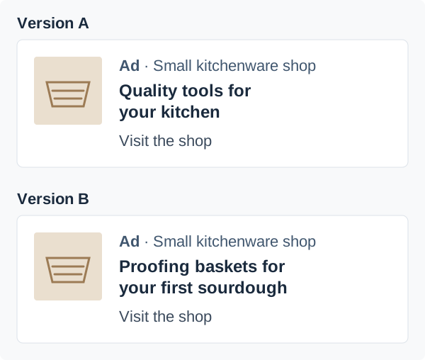
Banner blindness is not a reason to give up on ads. It is a reason to test them honestly, one change at a time. Take a baking site with a guide to a first sourdough loaf. Between the section on feeding the starter and the one on shaping the dough, there is an ad from a small kitchenware shop.
The shop’s first headline reads “Quality tools for your kitchen”. It is true, but it says nothing a reader needs at that point in the guide. The second version reads “Proofing baskets for your first sourdough”. Only the headline changes. The image, the link, the position and the “Ad” line stay the same, so any difference in the result comes from the words.
Each side has its own question. The advertiser asks whether a specific headline brings more people to the product page. The publisher asks whether the placement still lets readers finish the guide without losing their place. It helps to write down the expected answer before the test starts, together with the pages, devices and dates it covers.
Shown is not the same as seen
The study is a reminder that a counted impression only tells you an ad was on the screen. It does not tell you that anyone read it, and a click does not tell you that anyone bought something. Each number answers its own question, and it is worth knowing which one before comparing two versions.
Numbers also say little about why. Asking a handful of readers to go through the page and say what they noticed often explains more than a week of reporting: whether they saw the ad, whether they could tell who it was from, and whether they took the shop’s products for the site’s own advice.
A checklist for both sides
- Make the ad look like the content around it, not like a box from somewhere else.
- Keep the ad label and the advertiser’s name visible, so readers learn what it is by reading.
- Give your own recommendations their own part of the page, away from the ad.
- On a phone, check that your own content does not look like a promotion.
- Write a headline that says what the offer is at that point in the page.
- Change one thing per test and write down the expected result first.
- Know what each number counts before you compare two versions.
Try it on your own site
Planning an ad space on your own site, or looking for sites whose readers are already your customers? Join the waitlist and we will let you know when Plakard opens.